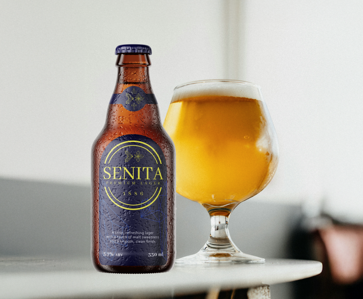
A rebrand of Foster’s, aiming to transform the reputation of a budget beer into a premium product.
Concept project while studying at Shillington.
The concept for this project explored bringing together both ingredients and people, to create an outcome greater than the sum of its parts.

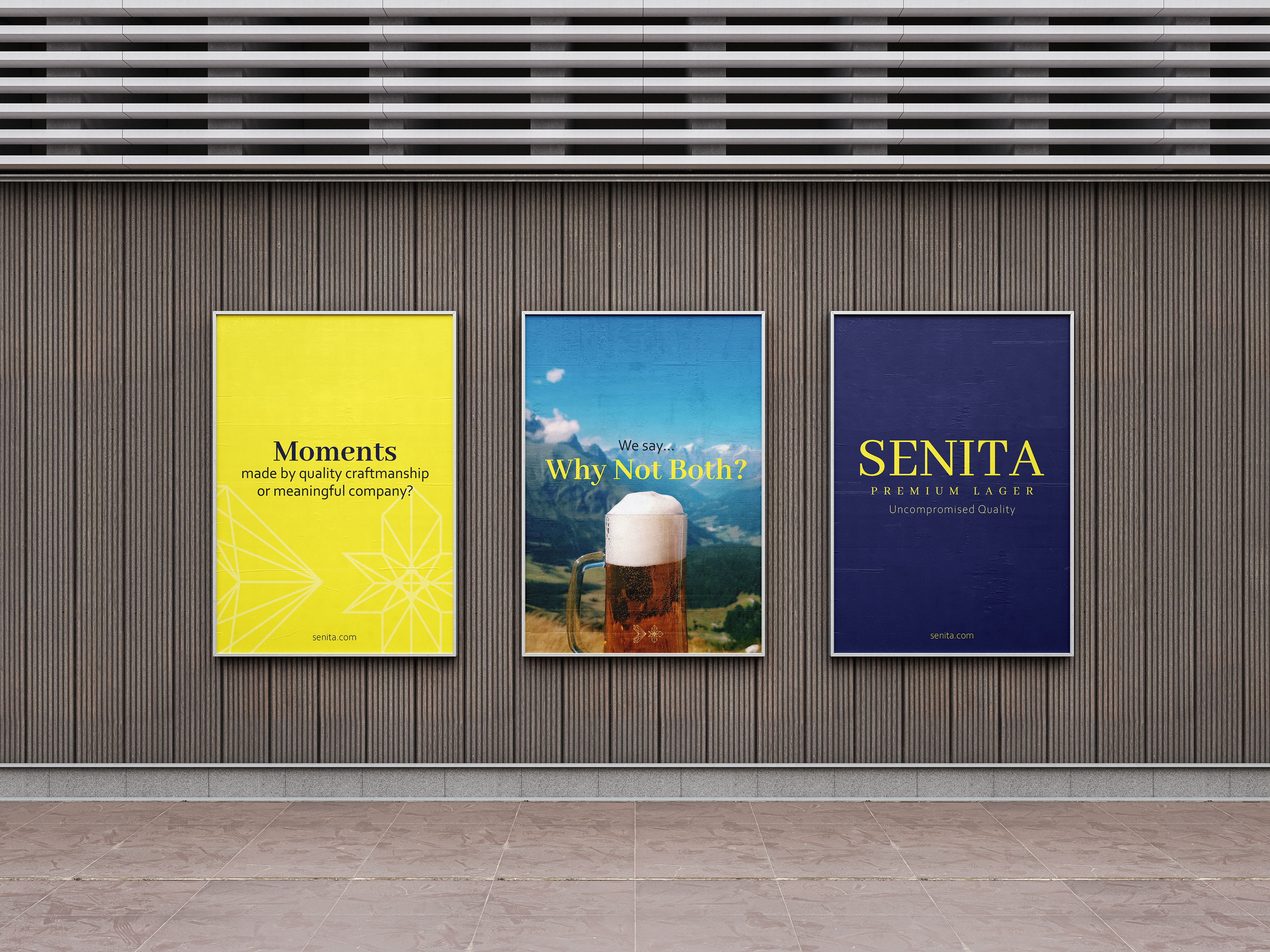
In order to pivot away from the cheap lager connotations of Foster's, I completely overhauled the visual language and tone of voice of the brand towards a much more sophisticated style. For example, ditching the cheap cans for a much more unique and elegant glass bottle.

The name Senita comes from the Senita moth and cactus, who share a symbiotic relationship; this mirrors the idea of the of the outcome being greater than the sum of its parts. This idea also birthed the logo mark of the brand: the "greater than" symbol alongside the "sum" symbol.

Using the same design template, variations of the beer can be easily distinguished using colour variations.


Here we see the moth and cactus used as graphic elements, as well as a more sophisticated, social tone of voice.


