Concept project while studying at Shillington.
This concept explores "watering the entrepreneurial flowerbed" -
supplying a business with the resources and support it needs to flourish into a beautiful, successful enterprise.
supplying a business with the resources and support it needs to flourish into a beautiful, successful enterprise.

A big focus when creating this app was ease of use and accessibility - to achieve this, I used a small colour palette and incorporated blank space, with one colour used to highlight key features. I also used soft rounded UI elements where possible to achieve this feel of accessibility.


I wanted the logo to reflect the idea of growth - both in a natural and entrepreneurial sense.
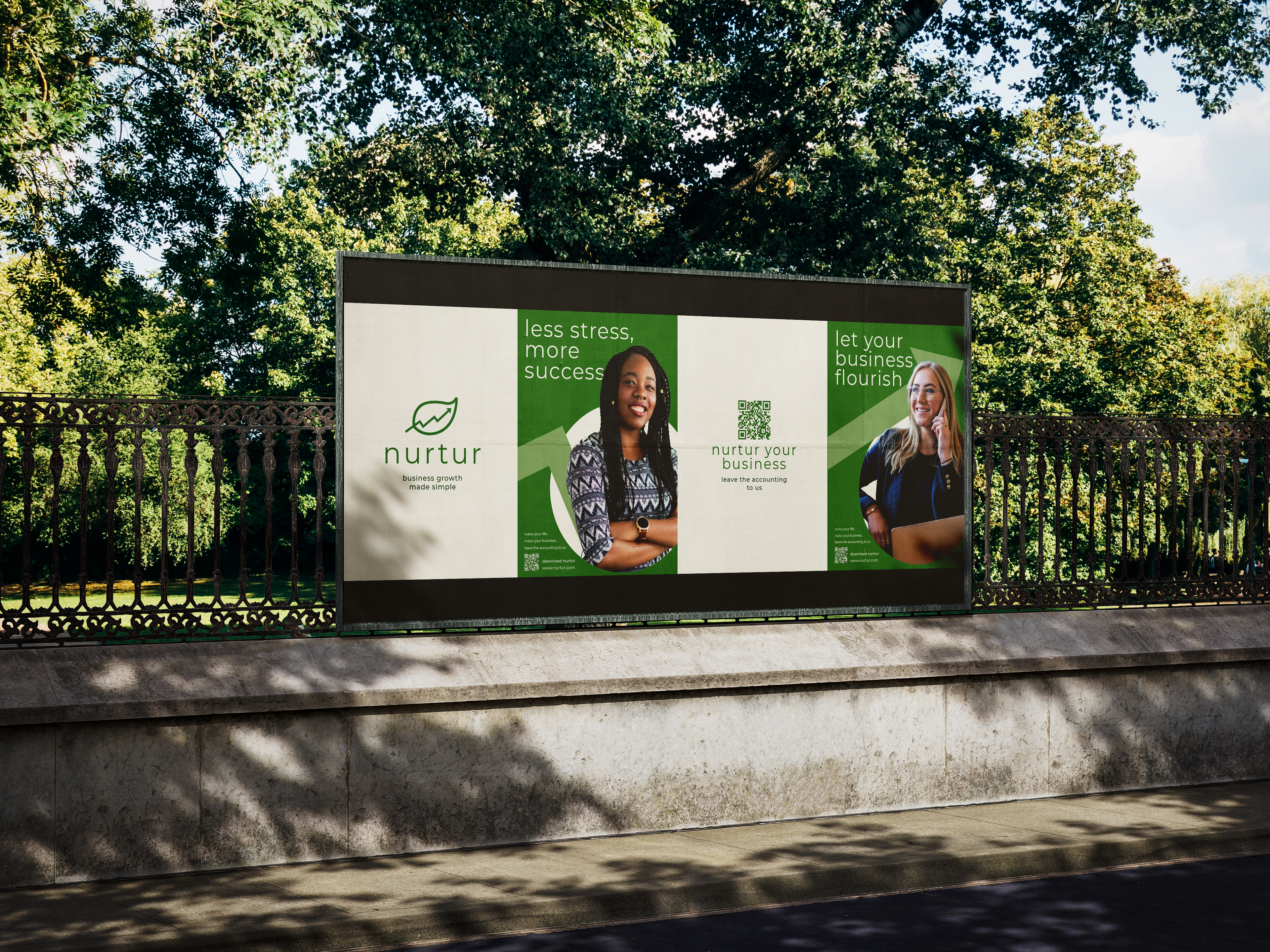
I wanted to use people as a focus rather than graphic elements, in order to reflect the people-first attitude of the brand.