An editorial brochure advertising a moving art exhibition in Finland.
Concept project while studying at Shillington.
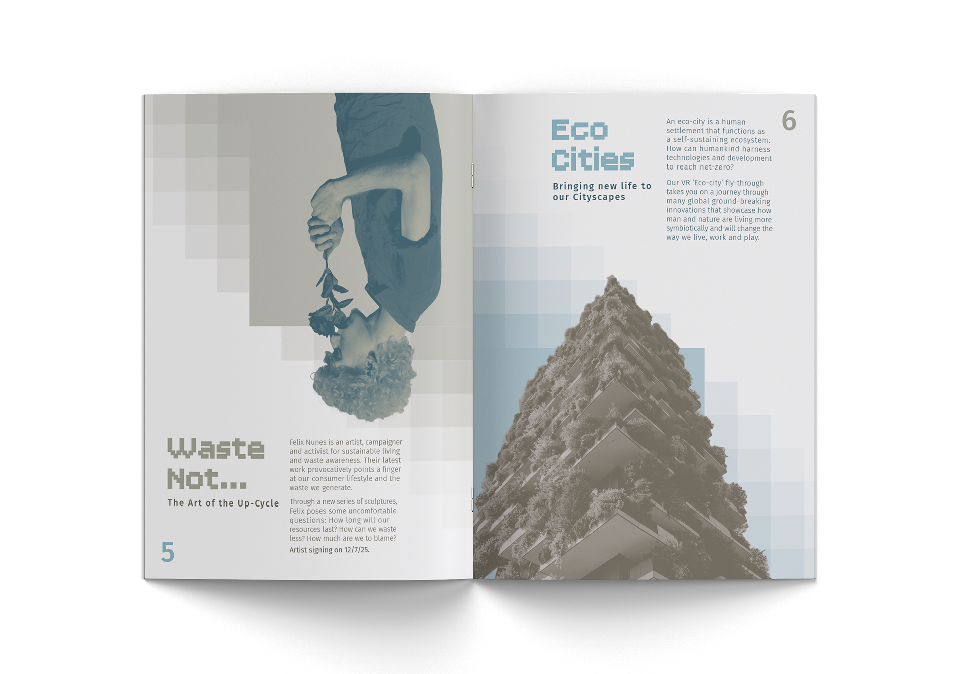
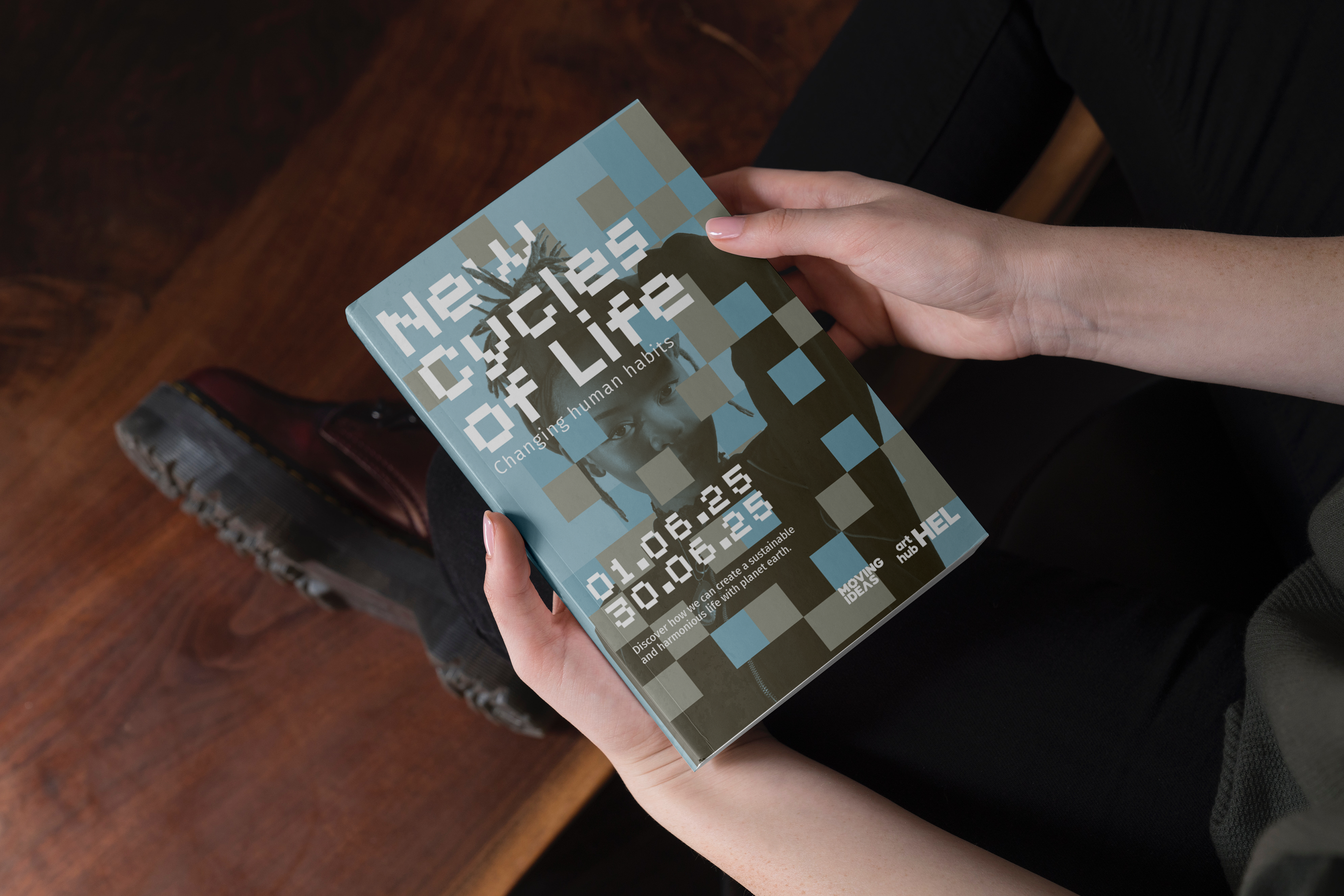
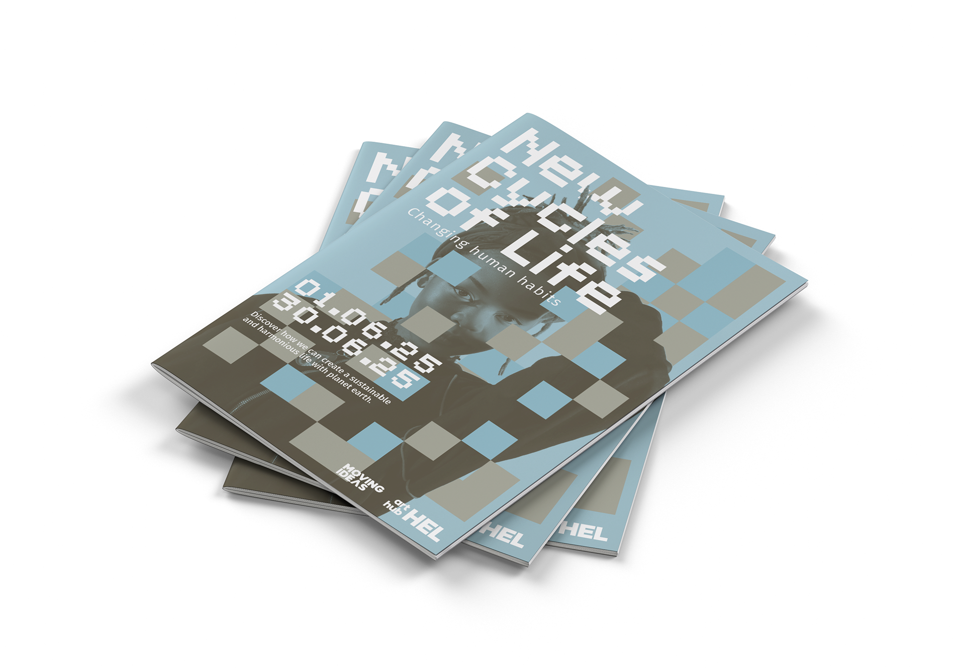
This concept explores the use of grids: a system of communication that spans generations - from mosaics to pixels.
The exhibit in question explores using humanity's past to try and shape its future, as well as the future of the planet. I chose to represent this exploration of time using the visual language of grids, as all throughout human history, grids have been used a method of communication - from mosaics to pixels.
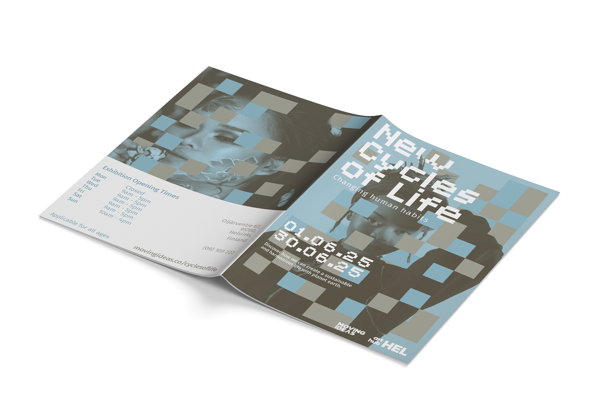
I chose a colour palette of blue and sandy beige to represent colours of the globe, reflecting the timeless nature explored within the exhibit.
I picked a pixelated typeface for my headlines to further explore  the grid-like visual language.
I picked a pixelated typeface for my headlines to further explore the grid-like visual language.
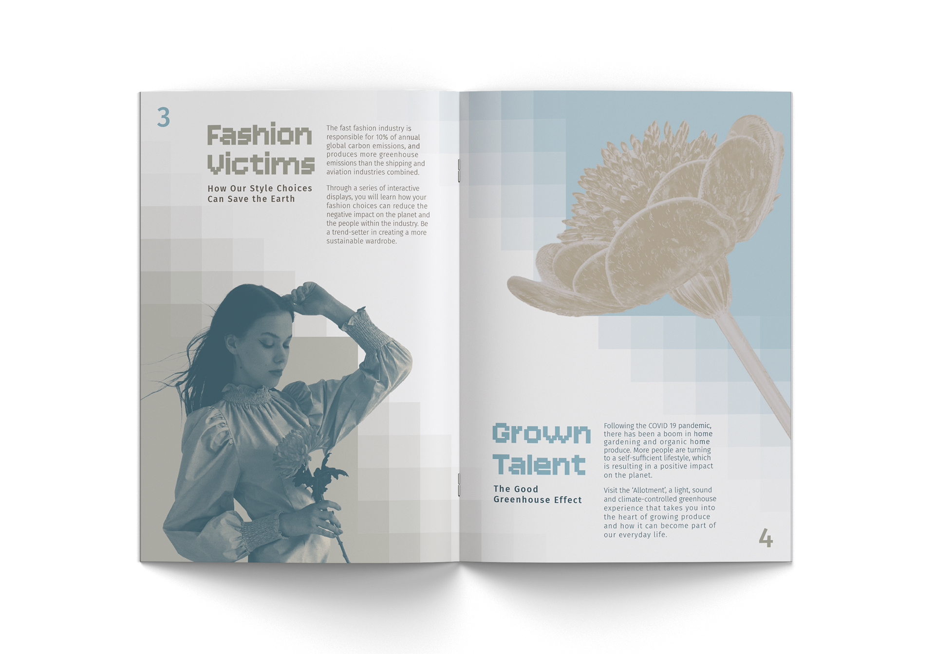
A big focus for the inside pages was type-setting the paragraphs into neat blocky shapes.
As a moving exhibition, it felt appropriate to use these temporary wayfinding signs as rollout. I think the square wooden posts are thematically appropriate, both for their shape, and natural material.
Back to Top